MetGo

MetGo

Get captivated by a stunning collection of images showcasing various subjects in our meticulously curated gallery.

MetgoBanner visual

Project Overview

Educational project that was aimed at designing an app that supports a mid-size metropolitan bus system and provides commuters with access to all bus route information.

My Role

Branding & direction
UX Research & UI design

Problem

Due to recent expansion, new bus routes have been added to the transit system. Many routes now share the same bus stop. Commuters now need access to this information to make sure they catch the right bus. The following were the top tasks to complete:

Requirements

  • Ensure any rider can tell when each of the busses arrives at the Washington & State bus stop
  • Ensure all riders can tell how much time they have to get to the Washington & State bus stop BEFORE the bus they need arrives at that stop
  • Allow riders to select one of the seven bus lines to see a list of its future arrival times at the Washington & State bus stop.

Research
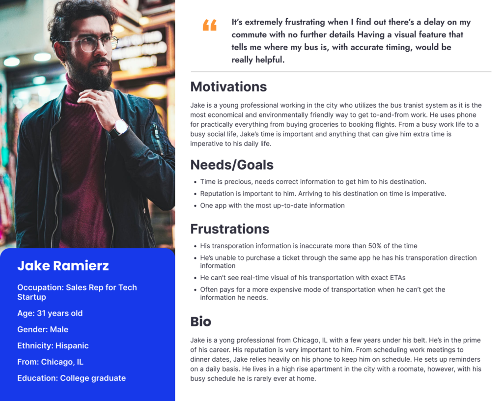
Persona

After surveying a group of users, I found the majority of public transit riders who relied on technology to provide their commute information were young professionals between the ages of 25-35. Below is a persona based on this data.

Asking the Right Questions

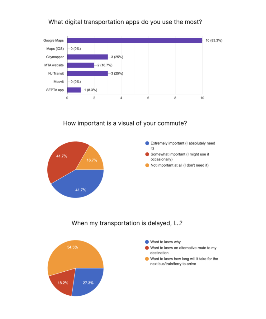
To understand what the users needed the most, I needed to ask some important information about the process of their current commute. What current apps do they use the most? What do they want to know if their commute is delayed? How would they like to be provided with the information of their commute?

Between the survey and interviews, I discovered that many users were most familiar with the Google Maps platform. They relied heavily on the visuals of the app (maps and routes) to understand their commute. A majority of users also expressed wanting more information when their bus was delayed so they could make an informed decision for their next steps.

Competitive Analysis

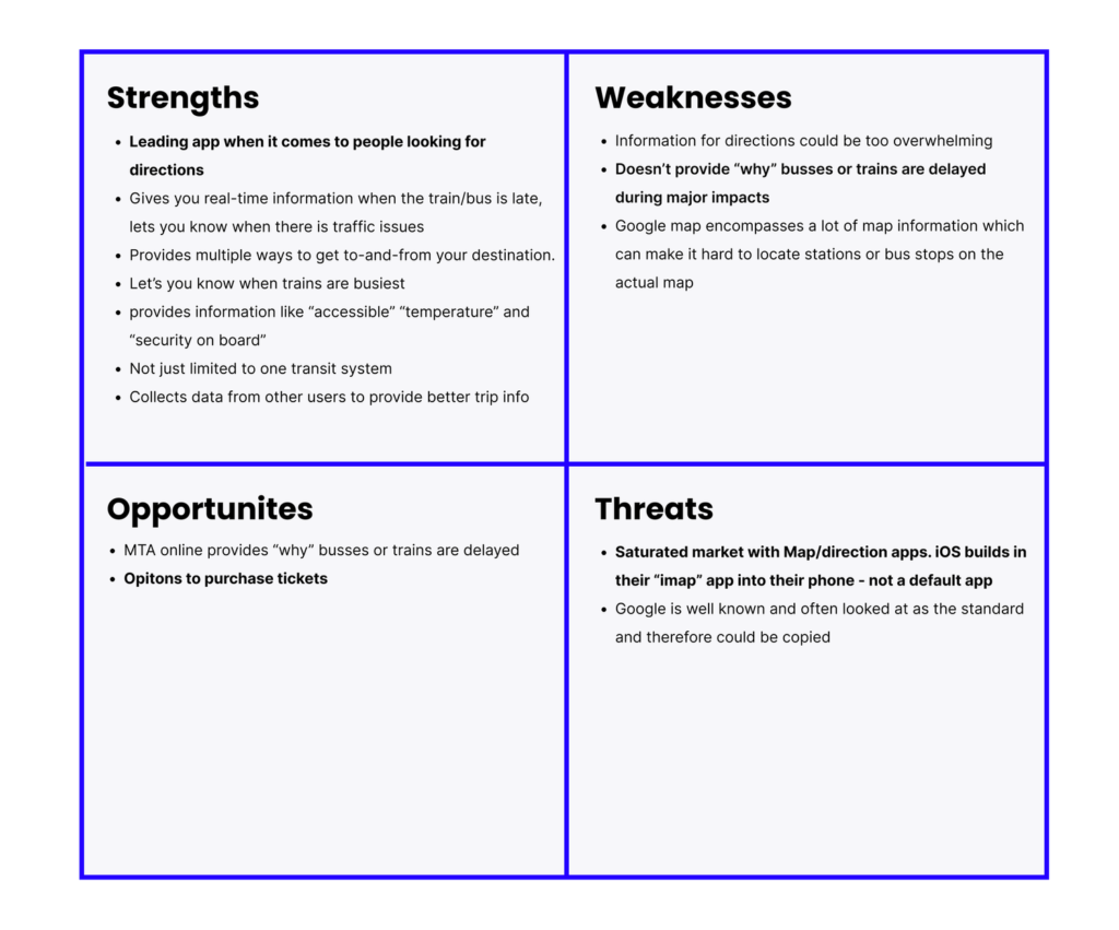
I conducted a SWOT Analysis on both Google Maps and Citymapper, however knowing our users were using Google Maps over 80% of the time, I felt this was the competitor to focus on the most.

SWOT Diagram

Iterative Process

User Flows & Site Map

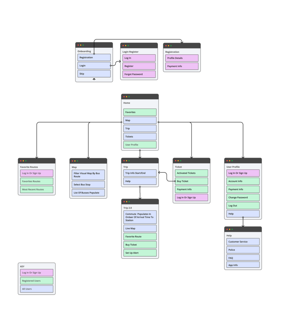
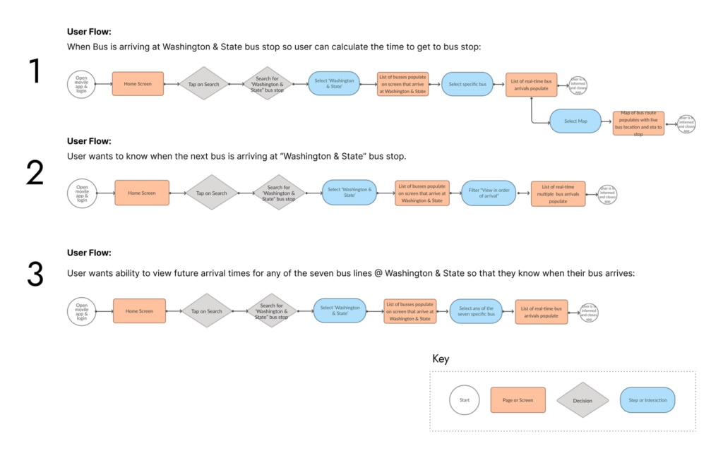
Upon compiling the user research, I began working through user flows of the specific problems, refining and adjusting as needed. Once I perfected those flows, it became clear what features were crucial and beneficial.

  • Users find when the bus is arriving at Washington & State bus station so users know how much time it takes to get to the bus stop
  • Users find when the next bus is arriving at Washington & State bus station
  • User can view future arrival times for any of the seven bus lines at Washington & State
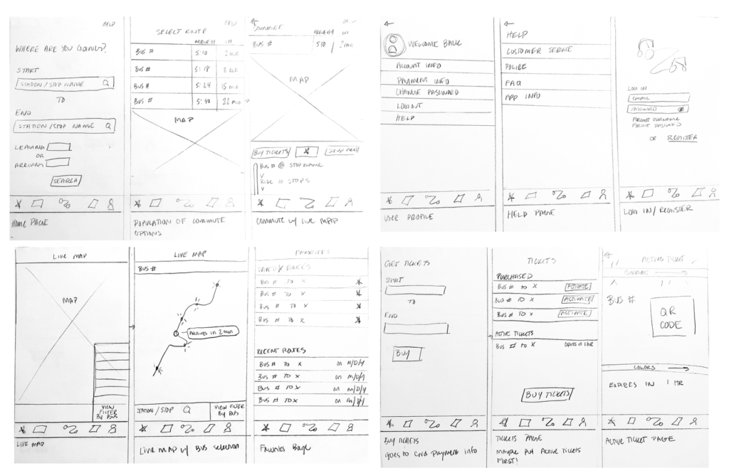
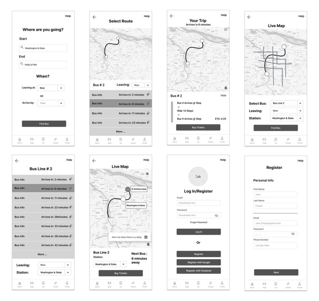
Sketches & Wireframes

Throughout my sketches and wireframes, I continued to think; “How smart can this product be?,” “What is important to him?” and “What technological features already exist that I can utilize to help get Jake from point A to B?” With these questions in mind, I kept refining and iterating my designs.

Branding Design

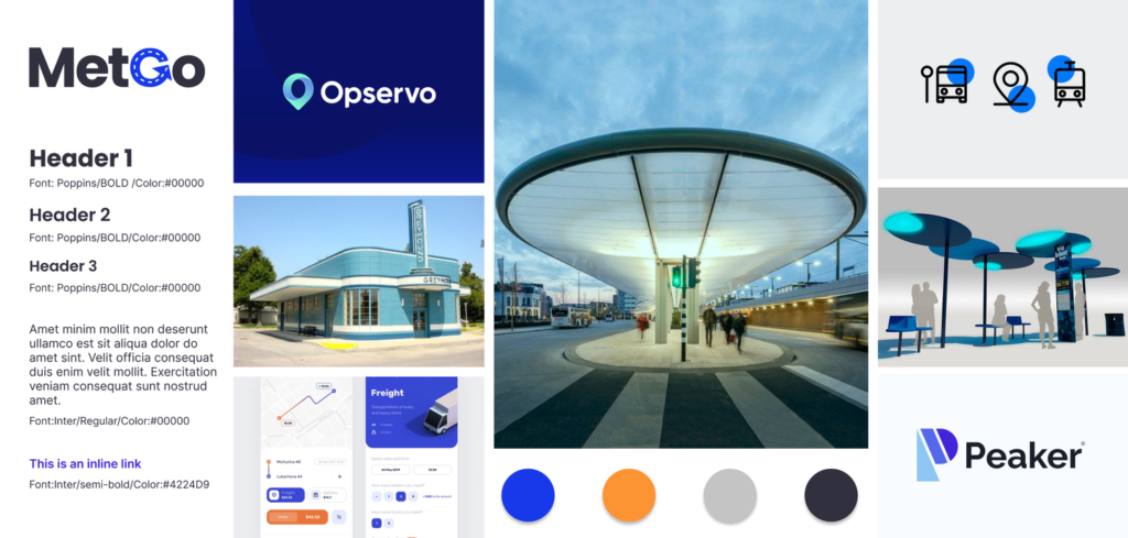
After establishing the name “MetGo”, I made multiple iterations of a logo and finalized on the simple, yet explanatory design below. I wanted the color scheme to be limited as I knew there would be multiple colors used to differentiate bus routes. Contrasting colors cobalt (main color) and orange (the selection) were chosen to make the app more accessible to all users.

User Testing

I learned so much through multiple user tests as I began to develop my product. Below are a list of key things that changed as a result of user testing.

  1. The Home Bar – The home bar went through many variations throughout this project. The landed navigations adjusted a few times as certain information became more valuable. User’s also weren’t responding to the various colors used and felt that it was over-designed.
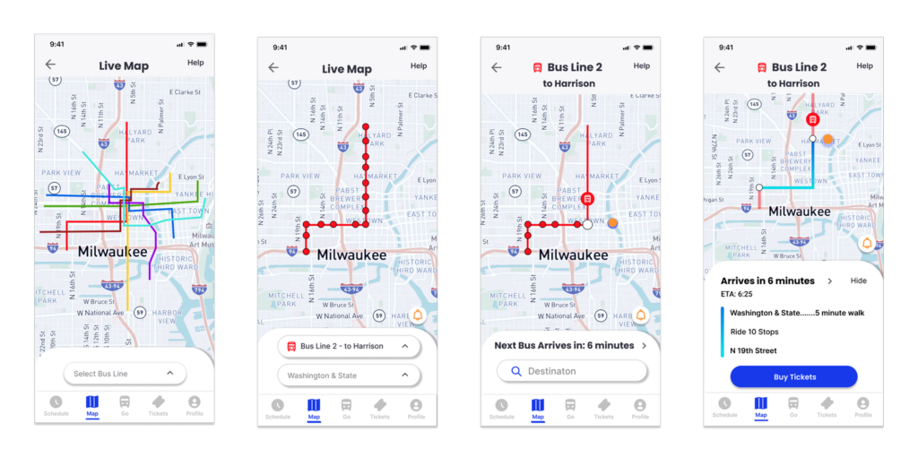
  2. The Live Map – Users struggled with understanding that the orange dot on the map was where the bus was currently located. Instead users thought that this was their live location.
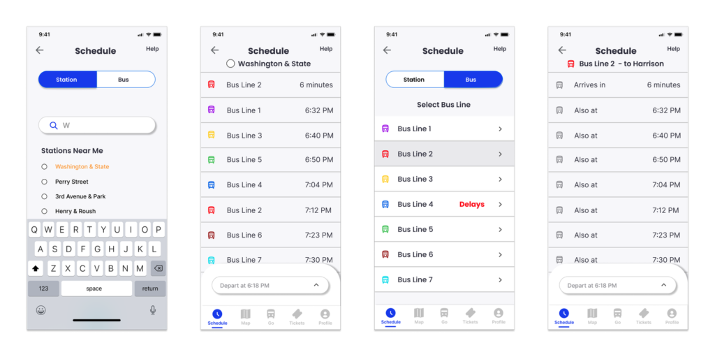
  3. Schedule – Upon my 2nd user testing, it was brought to my attention that users preferred to see a listed schedule. This made so much sense to me as a user would be able to access this information without having to log in or register.
  4. Contrast Buttons – The contrast buttons confused users and ultimately made them think twice about what they wanted to choose.
Final Design
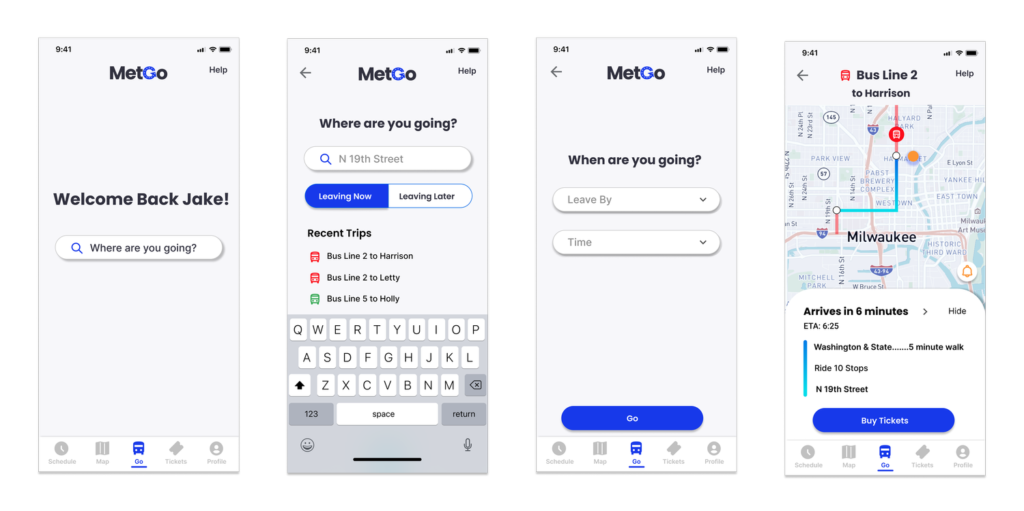
Go

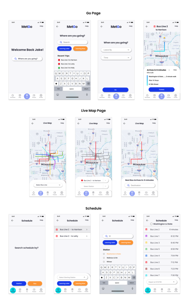
Knowing the user will frequent the app daily, I wanted the opening “home” page to already know the user and where they might be going. This “Go” flow takes the user to their destination in an easy manner. Users have the option to easily click on a recent route making their search even quicker. Users expressed that they also would like to have a visual of where the bus is on the map. Creating an icon that tracks the bus, helps users understand just how near or far the bus is from their stop.

Live Map

With over 80% of users expressing that they use Google Maps most frequently, I wanted to utilize a map feature where riders could look up their bus route on a live map. Upon selection, commuters can view the bus line and stops. Once they choose their station and destination, they are also able to see their specific route mapped out for them.

Schedule

During User Testing, schedules were a missed opportunity from the initial design. Being able to see the many bus routes that stop at the same station, was one of the main goals of this project. By using a segmented button control, users are able to search by station or bus when trying to locate their bus and arrival time. This helped speed up the process for users to find the information they needed.

Onboarding

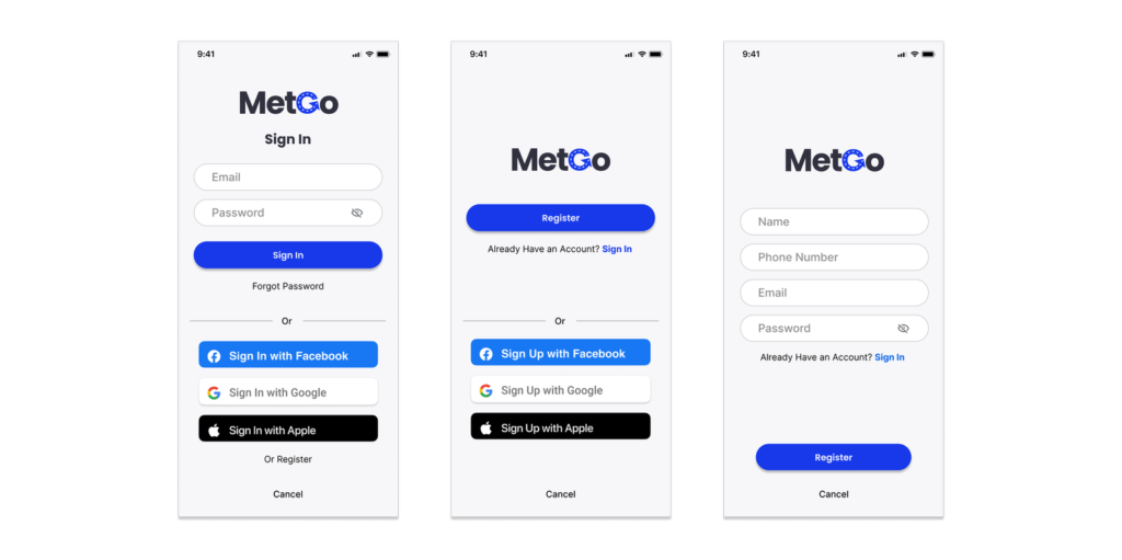
One of the ways this app begins to learn and help users get to their destination is for the user to register with the app. Though, not imperative to finding out bus information, users who register have access to buying tickets and creating an alert for their common bus routes. Utilizing third-party buttons to register allows riders to sign-up in only a few clicks making it easier for them to get their information.

Tickets

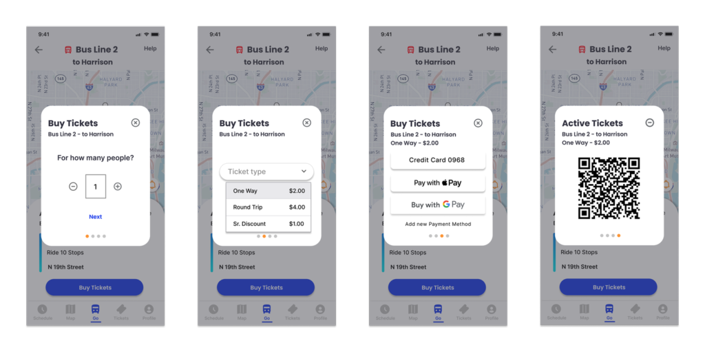
A feature I felt was important after much research, was the need for a place to purchase tickets. To keep users centralized and focused on their trip, I wanted to include this feature in their calculated route. Users have the option to stay on the page and go through a series of overlay screens to purchase any amount of tickets they need on their commute. Commuters have access to the ticket at any time on their route page.

Prototype

Test the prototype for yourself!

Summary

In conclusion, the final design completes all the goals we initially set out to accomplish. Users can:

  • Access information to all ETA bus arrivals for any station
  • Tell how much time they have to get to each station BEFORE the bus they need arrives at their station
  • Select one of the seven bus lines to see a list of its future arrival times

User testing has proven positive feedback on the overall clean design and flow. Simplicity was key in achieving these goals as well as understanding how users commute on a daily basis. Working on this project, I realize the full value of getting real-time feedback from live interviews and testing, a key factor in landing on the final successful design.